Case Study
Prudential Homepage Redesign


Intro
As the Senior UX Designer, I led the Prudential homepage redesign, my primary responsibility was to
leverage our robust design system effectively. This task was crucial in ensuring that the revamped homepage not only aligned with but also exemplified Prudential's best practices in user experience.
Design Process

01 Emphasis: UX Audit and User Insights
To thoroughly understand user challenges and needs within the Prudential Home website, I initiated a detailed audit and data-driven user insights investigation.
The objectives for this research phase were as follows:
Analyze and determine common user interaction patterns with the Prudential Home website, with a particular focus on how users engage with financial management tools and whether these interactions align with our existing design system.
Identify critical pain points and unmet user needs, leveraging behavioral data and user feedback, to inform enhancements to the design system that will improve the overall user experience.
UX Audit Findings: Enhancing User Experience to Reflect Prudential's Mission

Our comprehensive UX audit of the Prudential Home website revealed several key areas where user experience could be enhanced to better reflect the brand’s mission.
Underutilized Whitespace:
Our comprehensive UX audit of the Prudential Home website revealed several key areas where user experience could be enhanced to better reflect the brand’s mission.
Lack of Clear CTAs:
The absence of prominent CTAs in the prime real estate of the homepage is a missed opportunity. Effective CTAs are essential to guide users towards meaningful interactions, such as engaging with financial tools or learning more about services, which is a direct reflection of Prudential’s commitment to user empowerment.
Inconsistent Branding Elements:
The imagery used did not consistently reflect the branding or the company’s mission. Aligning images with Prudential’s message of financial empowerment and security can reinforce brand identity and resonate more deeply with the user’s financial aspirations.
Content Layout Resembling a Blog Page:
The current layout resembles a blog page, which may dilute the authoritative and professional impression a financial services provider like Prudential should embody. A more structured layout, with a clear differentiation between product offerings and educational content, can better serve user needs and Prudential’s branding.
02 Define: Google Analytics and User Insights
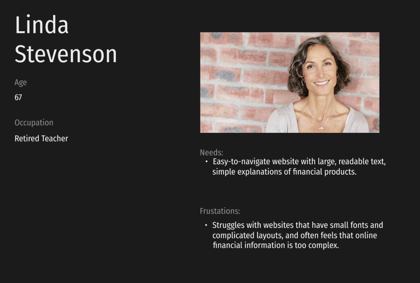
Instead of conducting customer interviews, I turned to Google Analytics to really understand how people use the Prudential Home website. This gave me a clear picture of what different visitors do on the site and what might be giving them trouble. With this information, I created profiles for three types of users: John Marshall, Sarah Howell, and Linda Stevenson. Each of these personas reflects the real needs and challenges that I saw in the data, from young adults just starting out to professionals managing their money, to retirees who value ease and clarity. They will guide us as we make a website that's easy and helpful for everyone.


03 ideate: Creating the frameworks
Drawing from our users' stories, I crafteed an IA that streamlines access to financial tools and knowledge in prudential. The proposed structure below is intuitive, placing users like John, Sarah, and Linda at the center of a more accessible and engaging online experience.

04 Low-Fidelity mockups
Next step was the sketch the wireframes based off of the the research I conducted on the users.


05 Prototype - High Fidelity
Lastly, in the prototype stage of the Prudential homepage redesign, I brought my earlier insights to life with a high-fidelity version. Using Figma, I transitioned from concept to an interactive, detailed design. This tool was pivotal for both design and prototyping, allowing for real-time feedback and iterative improvements.
Navigation

Hero Section

Financial Solutions, tools, and learning

Local professional/Newsletter Sign-Up
News & Articles

Ad Banner

footer

The final prototype, showcasing the prudential homepage, is interactive and responsive, ensuring a seamless user experience across various devices. To truly appreciate the depth and functionality of the design, I invite you to view the live prototype at the provided link